 Domexo.Digital
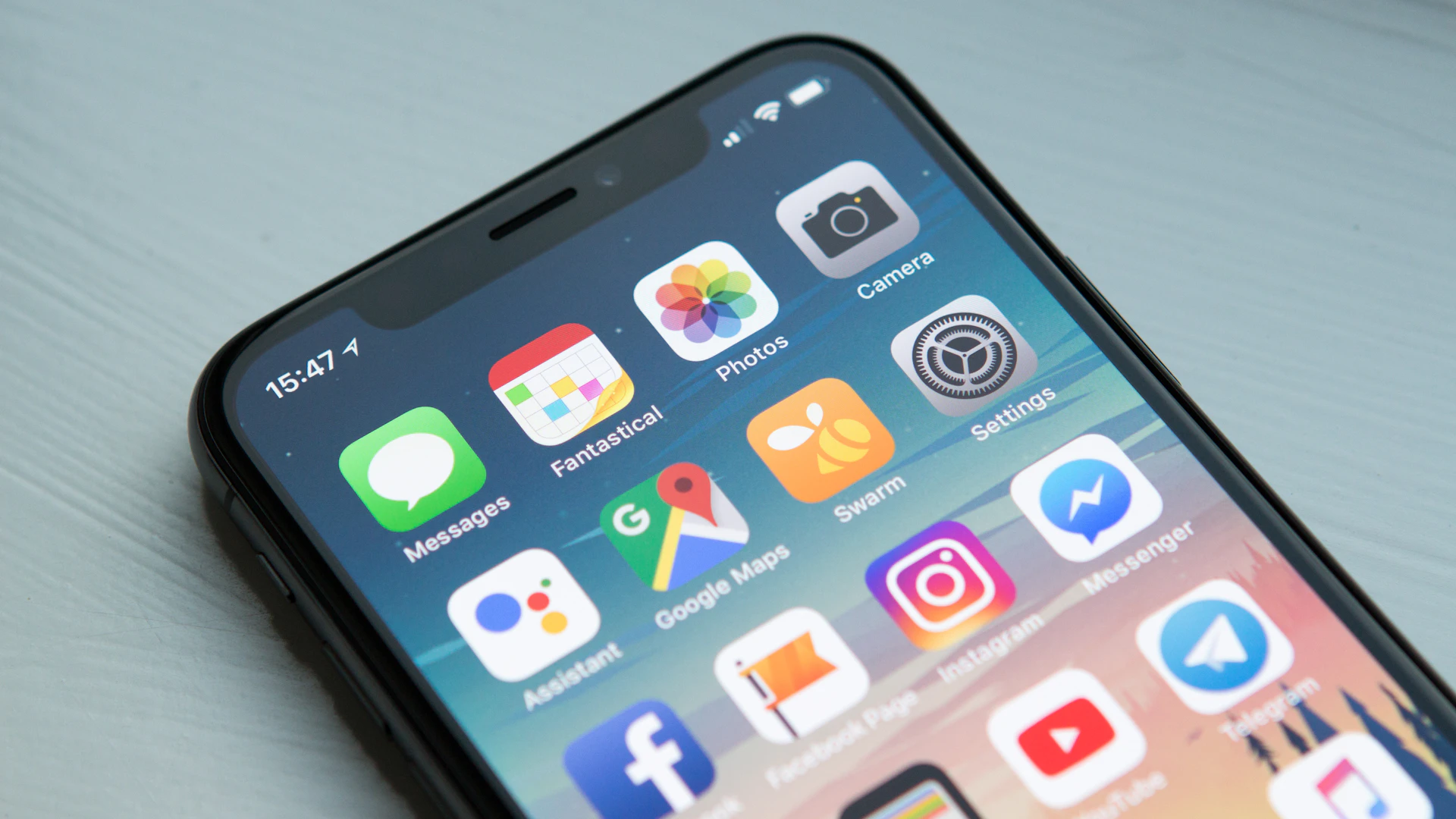
More than 60% of global web traffic comes from mobile devices[1] and the trend is growing. Yet many businesses still design primarily for desktop.
That's backwards, and it's costing you customers.
What Mobile-First Design Actually Means
Mobile-first design means starting with the smallest screen and building up, not the other way around. You design for phones first, then add enhancements for tablets and desktops.
Why? Because if you can make something work brilliantly on a tiny screen, it'll work everywhere. But if you start big and try to cram it down? Things break.
Think of it like packing a suitcase. It's easier to start with essentials and add extras if there's room, rather than stuffing everything in and hoping it fits.
Why This Matters for Your Business
Let's get practical about what mobile-first design means for your bottom line.
You're Losing Customers Right Now
Here's what happens when your site isn't mobile-friendly:
- 53% of mobile users abandon sites that take more than 3 seconds to load[2]
- 61% won't return to a mobile site they had trouble accessing[2]
- 40% will visit a competitor's site instead[2]
Let's say you get 1,000 visitors monthly and convert 3% into customers (industry average). If half are on mobile and your site isn't optimised, you're losing approximately 15 potential customers every month.
If each customer is worth £100 profit, that's £1,500 monthly—£18,000 annually—left on the table.
Google Penalizes Mobile-Unfriendly Sites

Since 2019, Google uses mobile-first indexing for all websites[3]. That means Google primarily looks at your mobile site to determine rankings, even for desktop searches.
What this means:
- Mobile-unfriendly = lower rankings = less traffic
- Slow mobile site = poor SEO performance
- Mobile usability issues = red flags to Google
User Behaviour Has Changed
People use their phones differently than computers:
- Attention span: Mobile users scan content quickly and make faster decisions
- Context: Often multitasking, in bright sunlight, or on the move
- Intent: Mobile users show immediate purchase intent in "micro-moments"[4]
- Interaction: Thumb-friendly taps, not precise mouse clicks
Your design needs to account for all of this.
Core Principles of Mobile-First Design
1. Content Hierarchy: What Matters Most?
On a small screen, you can't show everything at once. You must prioritise.
Ask yourself:
- What's the ONE thing users need to see immediately?
- What's the primary action you want them to take?
- What information is essential vs nice-to-have?
Scenario—Coffee Shop:
Desktop (lots of space):
- Large hero image
- Welcome message
- Full menu displayed
- Customer testimonials
- Opening hours
- Location map
- Instagram feed
- Newsletter sign-up
Mobile-first approach:
- Business name and tagline (identity)
- Primary CTA (Call to Action), e.g. "Order Now", "Find Us" button
- Today's hours
- Contact button
- Everything else is secondary, accessible via menu
2. Touch Targets: Make Buttons Tappable
Your finger is much less precise than a mouse cursor.
Minimum tap target size:
- 48×48 pixels
- We recommend extra spacing between targets
Common mistakes:
- Tiny "X" buttons on pop-ups (impossible to close)
- Links too close together (tap the wrong one)
- Small form inputs (frustrating to select)
- Dropdown menus that require precision
Fix it: Make buttons comfortably thumb-sized, especially for primary actions.
3. Typography: Readable Without Zooming
If users have to pinch-to-zoom to read your text, you've failed.
Minimum font sizes:
- Body text: 16px (absolutely minimum)
- Headings: 20-24px minimum
- Button text: 16-18px
Best practices:
- Use clear, readable fonts (system fonts work great)
- Increase line height on mobile (1.5-1.6x)
- Keep line length short (45-75 characters)
- High contrast between text and background
4. Navigation: Simple and Accessible
Complex mega-menus don't work on mobile.
Mobile navigation patterns that work:
Hamburger Menu:
- Classic three lines in the corner
- Reveals full menu when tapped
- Best for: Sites with lots of pages
Tab Bar:
- 3-5 icons at bottom of screen
- Always visible, one tap to any section
- Best for: Apps and app-like sites
Priority+:
- Show important links, hide rest in "More"
- Adapts to available space
- Best for: Variable number of menu items
Sticky Header:
- Main menu stays at top while scrolling
- Quick access to key actions
- Make sure it doesn't take up too much screen space
5. Forms: Make Them Easy
Forms on mobile are painful when done wrong.
Mobile-friendly form design:
- One column layout only (never side-by-side fields)
- Large input fields (minimum 44px tall)
- Appropriate keyboard types (number pad for phone, email keyboard for email)
- Auto-fill enabled for addresses and credit cards
- Clear error messages next to the problem field
- Save progress if it's a long form
Reduce fields: Ask yourself: "Do we REALLY need this?" Every field you remove increases completion rates.
Example: Contact Form
Before (7 fields):
- First name
- Last name
- Phone
- Company
- Job title
- Message
After (3 fields):
- Name (one field)
- Message
Result: 40% increase in form submissions.
6. Images and Media: Fast Loading
Images are often the biggest performance killer on mobile.
Optimisation checklist:
- Compress all images (TinyPNG, Squoosh)
- Use modern formats (WebP with fallbacks)
- Implement lazy loading (images load as you scroll)
- Serve different sizes for different screens
- Avoid auto-playing videos (they eat data and battery)
Hero images:
- Desktop: High-res 2500px wide
- Tablet: 1200px wide
- Mobile: 800px wide
- File size goal: Under 200KB
7. Speed: Every Millisecond Counts
53% of mobile users leave if a page takes more than 3 seconds to load[2].
Quick wins for mobile speed:
- Minimise JavaScript
- Remove unused scripts
- Defer non-critical JS
- Use modern, lightweight frameworks
- Critical CSS
- Inline critical styles
- Load rest asynchronously
- Reduce Server Response Time
- Use a CDN (Cloudflare free tier)
- Enable caching
- Optimise database queries
- Eliminate Render-Blocking Resources
- Delay loading below-the-fold content
- Remove unnecessary fonts
- Minimise third-party scripts
Test your speed:
- Google PageSpeed Insights
- WebPageTest.org (shows film strip of loading)
- Lighthouse in Chrome DevTools
Aim for a score above 90 on mobile.
Designing for Touch vs Mouse
The interaction model is fundamentally different.
Touch Gestures You Should Support
- Tap: Primary interaction (equivalent to click)
- Swipe: Navigate between items, reveal menus
- Pinch: Zoom (especially for images)
- Long press: Reveal contextual menus
Don't rely on:
- Hover states (touch doesn't hover)
- Right-click (mobile has no right-click)
- Keyboard shortcuts
- Precise positioning
The Thumb Zone
Most users hold their phone in one hand and use their thumb to navigate.
The thumb reaches:
- Bottom centre and sides easily (green zone)
- Middle of screen with stretch (yellow zone)
- Top of screen is difficult (red zone)
Design implications:
- Primary actions: Bottom third of screen
- Navigation: Top (okay) or bottom (better)
- Critical content: Middle
- Decorative elements: Anywhere
Responsive vs Mobile-First: What's the Difference?
Responsive design: Start with desktop, add media queries to make it work on mobile Mobile-first design: Start with mobile, enhance for larger screens
Why mobile-first wins:
- Forces prioritisation: Limited space means focusing on what matters
- Performance: Smaller baseline means faster loading
- Progressive enhancement: Add features for devices that can handle them
- Future-proof: New devices tend toward mobile capabilities
Testing Your Mobile Experience
You must test on real devices. Browser resizing isn't enough.
Essential Test Devices
Minimum:
- One current iPhone (Safari behaviour)
- One Android phone (Chrome behaviour)
- One older device (performance baseline)
Can't afford devices?
- BrowserStack (free trial)
- Use friends' and family's phones
- Visit a phone shop and test there
Testing Checklist
Navigation:
- Can you tap every menu item easily?
- Does the hamburger icon work smoothly?
- Is it clear where you are on the site?
Content:
- Is all text readable without zooming?
- Do images load quickly?
- Is the content hierarchy clear?
Forms:
- Can you fill out forms easily?
- Does the right keyboard appear?
- Are error messages clear?
Performance:
- Does the site load in under 3 seconds?
- Are interactions smooth (no lag)?
- Does it work on slow 3G?
Interactions:
- Are all buttons tappable?
- No accidental taps on nearby elements?
- Swipe gestures work as expected?
Common Mobile Design Mistakes
Mistake #1: Tiny Text
Problem: Body text at 12-14px
Fix: Minimum 16px, ideally 18px for body text
Mistake #2: Horizontal Scrolling
Problem: Content wider than screen requires side-scrolling
Fix: Ensure all content fits viewport width, use max-width: 100% on images
Mistake #3: Pop-ups You Can't Close
Problem: Modal covers screen, close button too small to tap
Fix: Make close button 44x44px minimum, add background tap to close
Mistake #4: Fixed-Width Content
Problem: Content doesn't adapt to screen size
Fix: Use relative units (%, em, rem) instead of fixed pixels
Mistake #5: Auto-Playing Videos
Problem: Eats data, drains battery, annoys users
Fix: Only play on user interaction, provide clear play button
Mistake #6: Invisible Buttons
Problem: Buttons look like text or are too subtle
Fix: Clear visual affordances (borders, background colours, shadows)
Mobile-First in Practice: Illustrative Scenarios
Scenario 1: E-commerce Product Page
Mobile-first approach:
- Product image (large, swipe-able gallery)
- Product name and price (immediately visible)
- "Add to Cart" button (large, fixed at bottom)
- Key features (bullets, scannable)
- Reviews (collapsed by default, expand to read)
- Full description (below the fold)
Why it works: User can decide to buy within 3 seconds without scrolling.
Scenario 2: Typical Scottish Restaurant
Mobile-first approach:
- Restaurant name and hero image
- "Book Table" and "Directions" buttons
- Today's hours (highlighted)
- Location with map (include parking info)
- Menu (expandable sections)
- Contact info
Why this works: Visitors are often on-the-go and need information fast.
Scenario 3: Portfolio or Freelancer Site
Mobile-first approach:
- Your name and what you do (1 sentence)
- Best work (3-4 pieces, large images)
- "Get in touch" button
- More work (below the fold)
- About (brief)
- Contact form
Why it works: Shows your work immediately, clear path to contact.
Making the Transition
If you have an existing desktop-first site, here's how to shift:
Phase 1: Audit (Week 1)
- Test your site on mobile devices
- Note what's broken or frustrating
- Check Google Search Console for mobile usability issues
- Run PageSpeed Insights
Phase 2: Quick Wins (Week 2-3)
- Fix obvious mobile issues
- Improve tap target sizes
- Optimise images
- Fix any viewport or text size problems
Phase 3: Redesign (Month 2-3)
- Redesign key pages mobile-first
- Start with homepage and top landing pages
- Gradually roll out to entire site
- Test each page on real devices
Tools and Resources
Design Tools:
- Figma (free, includes mobile frames)
- Adobe XD (free starter plan)
- Sketch (Mac only, but excellent)
Testing Tools:
- Google Mobile-Friendly Test
- BrowserStack (cross-device testing)
- Chrome DevTools Device Mode
Performance:
- Google PageSpeed Insights
- WebPageTest
- Lighthouse
Inspiration:
- Mobbin (mobile design patterns)
- Really Good User Experience (mobile examples)
- Dribbble mobile tag
The Bottom Line
Mobile-first design isn't a trend—it's the reality of how people use the web today. And it will only become more important.
Start with these three questions:
- What's the most important thing users need to do on my site?
- Can they do it easily on a phone right now?
- If not, what's stopping them?
Fix those issues first. Everything else is secondary.
Your mobile experience is your first impression, your storefront, and often the deciding factor in whether someone becomes a customer.
Make it count.
Need help creating a mobile-first website that actually works for your business? Let's talk about how we can help.